
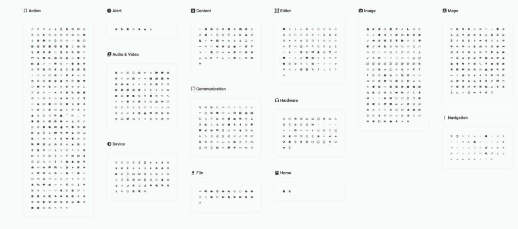
Material Design Icons for Figma provide a reliable and consistent icon set for designers working on modern web and mobile interfaces. Based on Google’s Material Design guidelines, these icons are widely used across apps, dashboards, and websites because they are simple, readable, and easy to scale across different screen sizes.
Icons play a critical role in usability. They help users navigate interfaces faster, recognize actions instantly, and understand content without relying solely on text. A well designed icon set ensures visual consistency while keeping interfaces clean and intuitive. This Material Design Icons library brings that consistency directly into Figma, making it easy to design and prototype without switching tools.
Because the icons are vector based, they remain sharp at any size. You can quickly adjust color, scale, and alignment to match your layout, whether you are designing a mobile app, a web dashboard, or a full design system. This makes the library especially useful for UI designers, UX designers, product teams, and developers who need a dependable icon foundation.
What you can use Material Design Icons for
This icon library works across a wide range of design projects:
- Navigation icons for web and mobile apps
- Action icons for buttons and controls
- Dashboard and analytics interfaces
- Forms, settings, and system UI elements
- Design systems and component libraries
- Prototypes and wireframes
Why Material icons are so popular
Material Design Icons are designed to be neutral and functional. They blend well with different visual styles, from minimal SaaS products to complex enterprise dashboards. Because they follow clear rules for stroke weight, spacing, and geometry, they create a cohesive experience across large interfaces.
Another advantage is familiarity. Many users already recognize Material icons from Android apps and Google products. This reduces learning curves and improves usability, especially in applications where clarity and speed matter.
Tips for using icons effectively
To get the most out of this figma icons set, keep these best practices in mind:
- Use icons consistently for the same actions across screens
- Pair icons with labels when clarity is important
- Keep icon sizes uniform within the same interface
- Use color intentionally to indicate state or importance
- Avoid mixing multiple icon styles in one product
Easy to integrate in Figma
This free template by smrkv is easy to duplicate and integrate into your existing files. You can combine it with UI kits, dashboards, and design systems to create a complete interface toolkit. Whether you are building from scratch or refining an existing product, having a solid icon library saves time and improves design quality.
Download Figma IconsReport missing link